Gauer has a new look!
Innovation: this is the best word to define what we prioritize when manufacturing automotive components! That’s why it’s time to bring this priority to the Gauer brand as well.
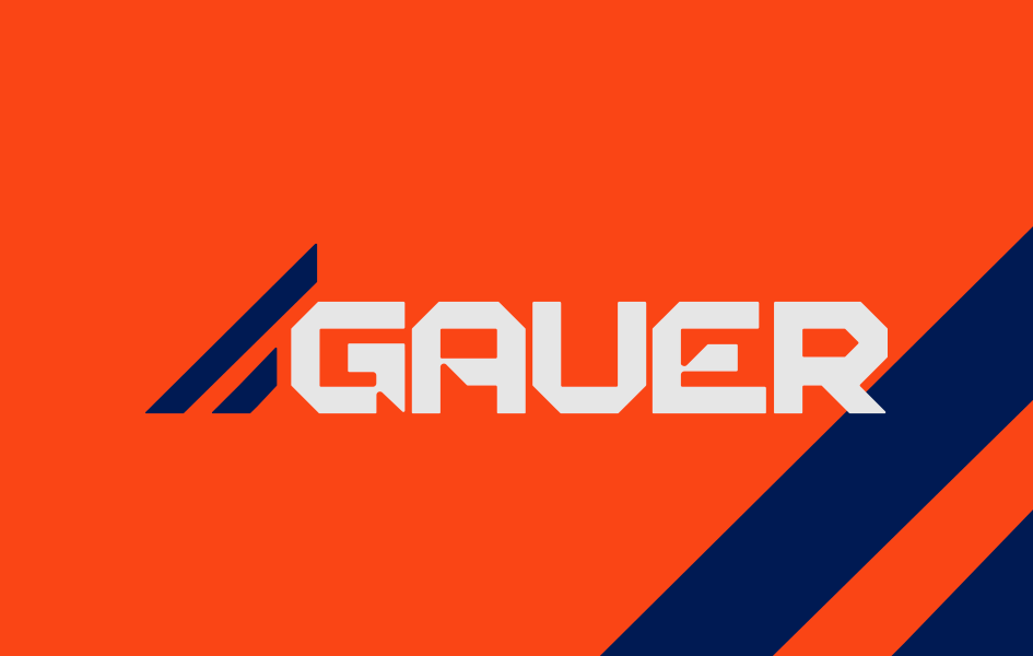
We have a new logo and a completely revamped visual identity!
Now, the Gauer brand reflects the modernity of our products, bringing us even closer to the dealers who trust our work and the truck drivers who choose our solutions.
The elements of our new visual identity convey our professionalism, product quality, and market trust, investing in light gray, blue, and phoenix orange with the same goal.
Speaking of colors, orange was used predominantly to demonstrate dynamism and energy, and is also the color present in Gauer’s product lenses, as well as in the phoenix, which is the crest of the family that founded and keeps the company thriving.
The creation of the new logo was inspired by the lanterns produced by the company and automotive and industrial design, with the lines representing rays of light.
The new visual also features uppercase letters for prominence, along with simple shapes to remain visually appealing.
We hope you like the new look. And rest assured: the Gauer quality you already know will remain on the roads!
Gauer: excellence and innovation move us.
To stay updated on more news, follow us on social media. We are on Facebook and Instagram.